Logo
Choosing the Right Mark
Our mark is the primary brand element on our own properties, such as our websites and products. Here, it can stand on its own.
When our brand is represented in other contexts, throughout the web or in products we do not own, it is usually best to use a lockup. Please do not edit, change, distort, recolour, or reconfigure the Logos mark. Our mark is the primary brand element on our own properties, such as our websites and products.
Primary Mark
Lockup — Vertical
These vertical lockups are best used horizontally in a line.
Lockup — Horizontal
These horizontal lockups are best stacked vertically.
Clear Space
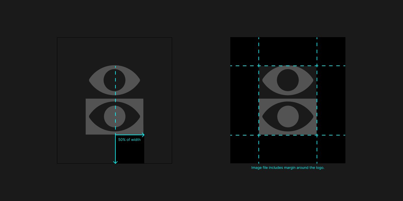
When placing the logo, it’s important that it’s given enough space from other elements on the surface it’s presented on. The clear space is 50% of the width of the Logos mark. This clear space is accounted for as a margin in all our logo assets, so simply mind the edges of the image.
If you need to define the unit of space, the best way is to measure the bottom of any given mark to the edge of the image or the baseline of the logotype in the lockup to the bottom edge of the image.

Co-branding
Often, our brand marks will be used as a family or in different combinations. All of our marks and lockups are designed to work together. The two major rules here are the consistency of size and the consistency of style.
Hierarchy is determined by the placement order, the most important being left in the case of horizontal layouts or top in the vertical case. Vertical lockups are used in horizontal layouts, and horizontal lockups in vertical layouts.
- All marks should be the same size
- Priority is determined by order, not scale
- All marks should be the same style
- Do not mix lockups and non-lockups
- Do not mix vertical lockups with horizontal lockups


